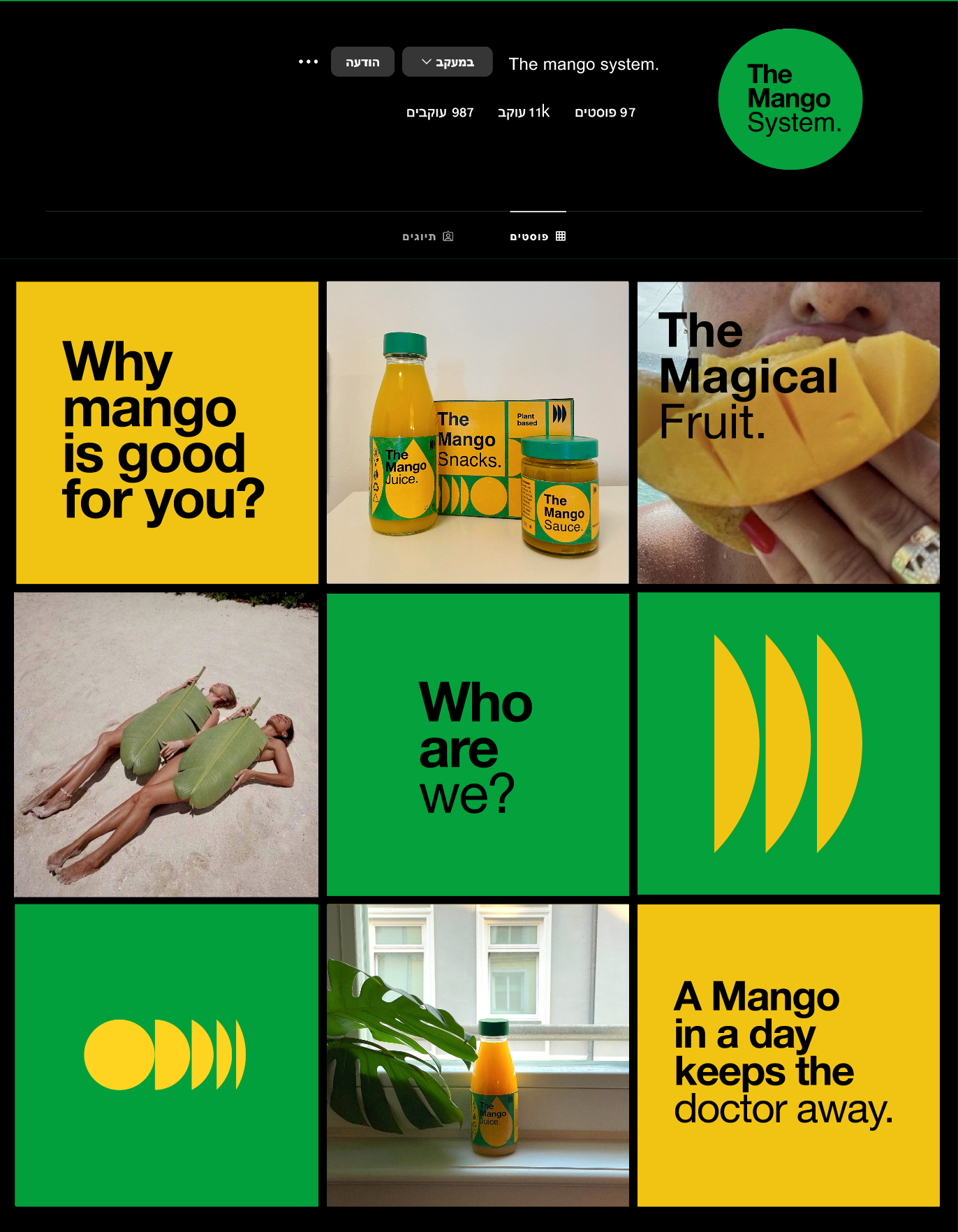
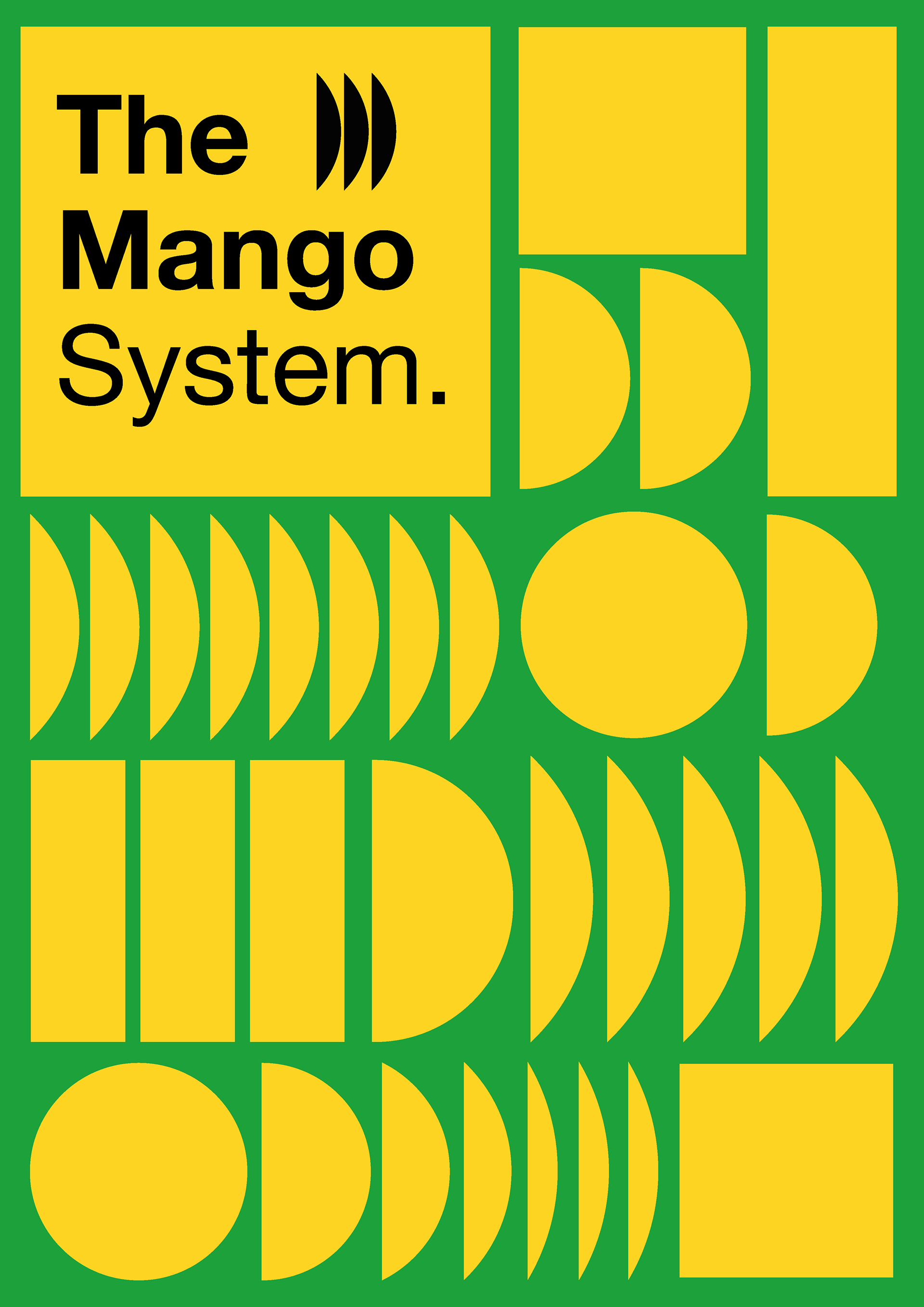
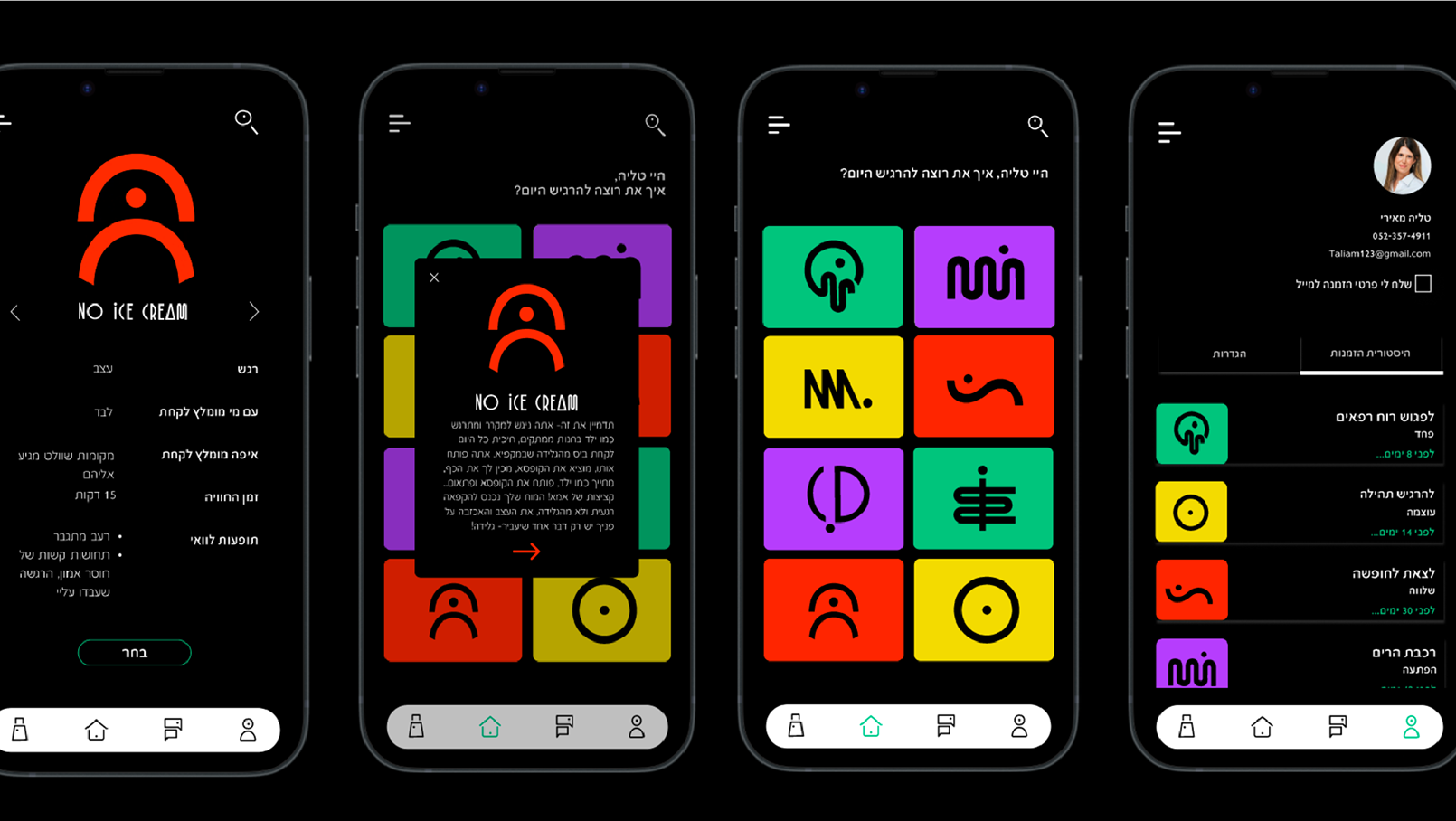
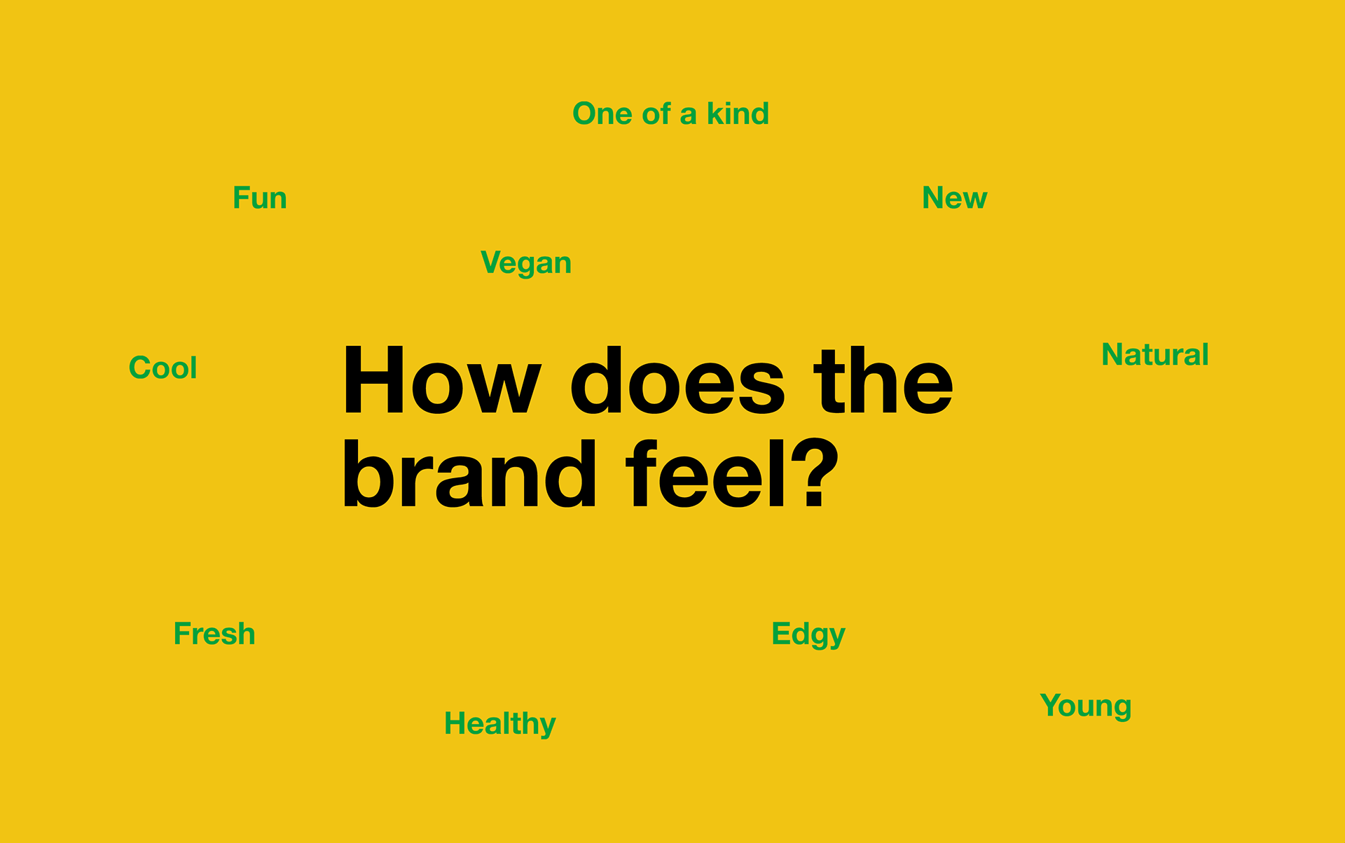
The Concept
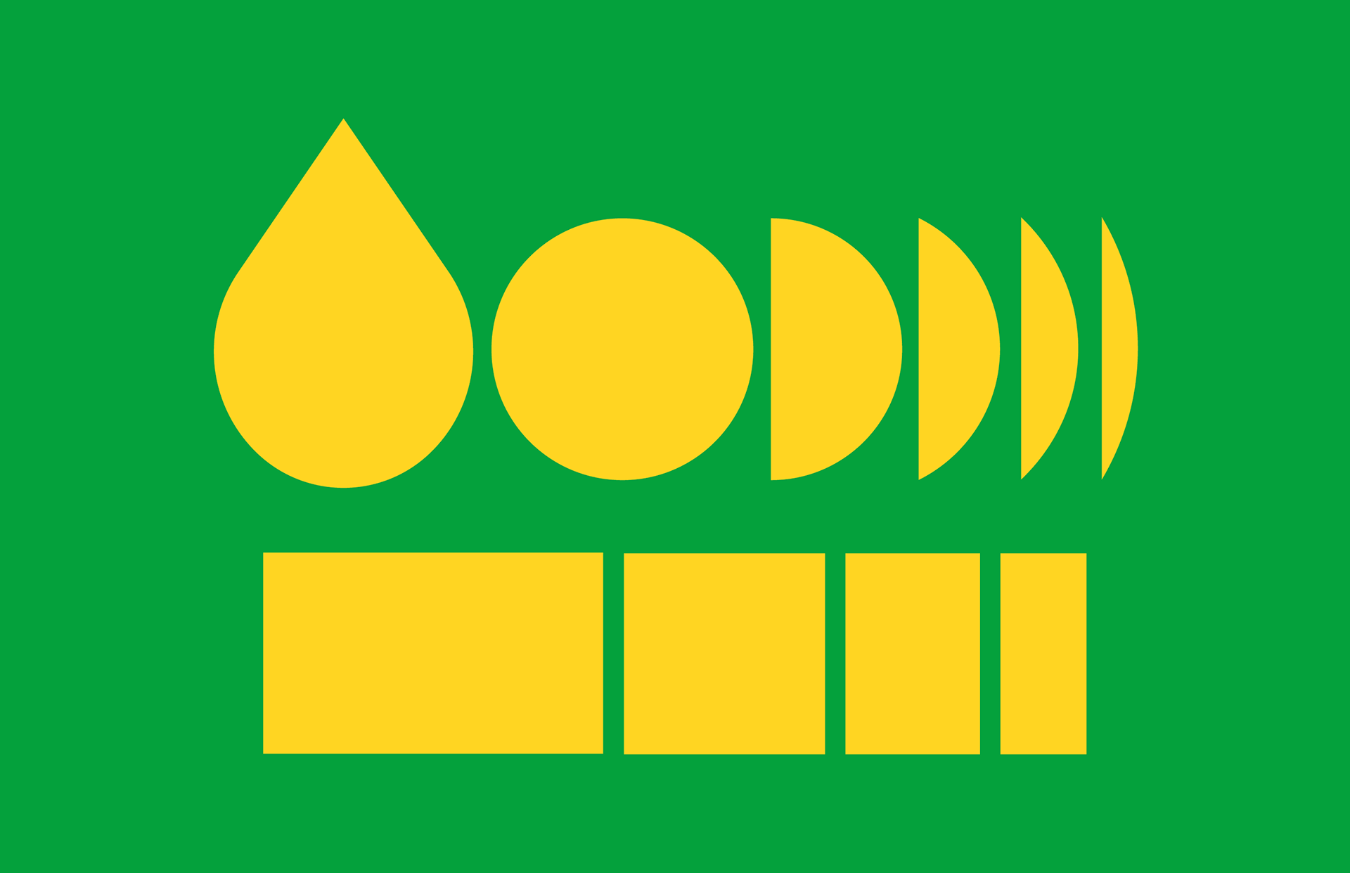
The concept came from the mango’s diverse shapes. From different points of view—cuts, sections, and outlines—the mango revealed itself as a whole system of forms. I approached the mango as a design system, shaping it into the basis for the brand’s visual language. inspired by the clarity and structure of Swiss geometric design.
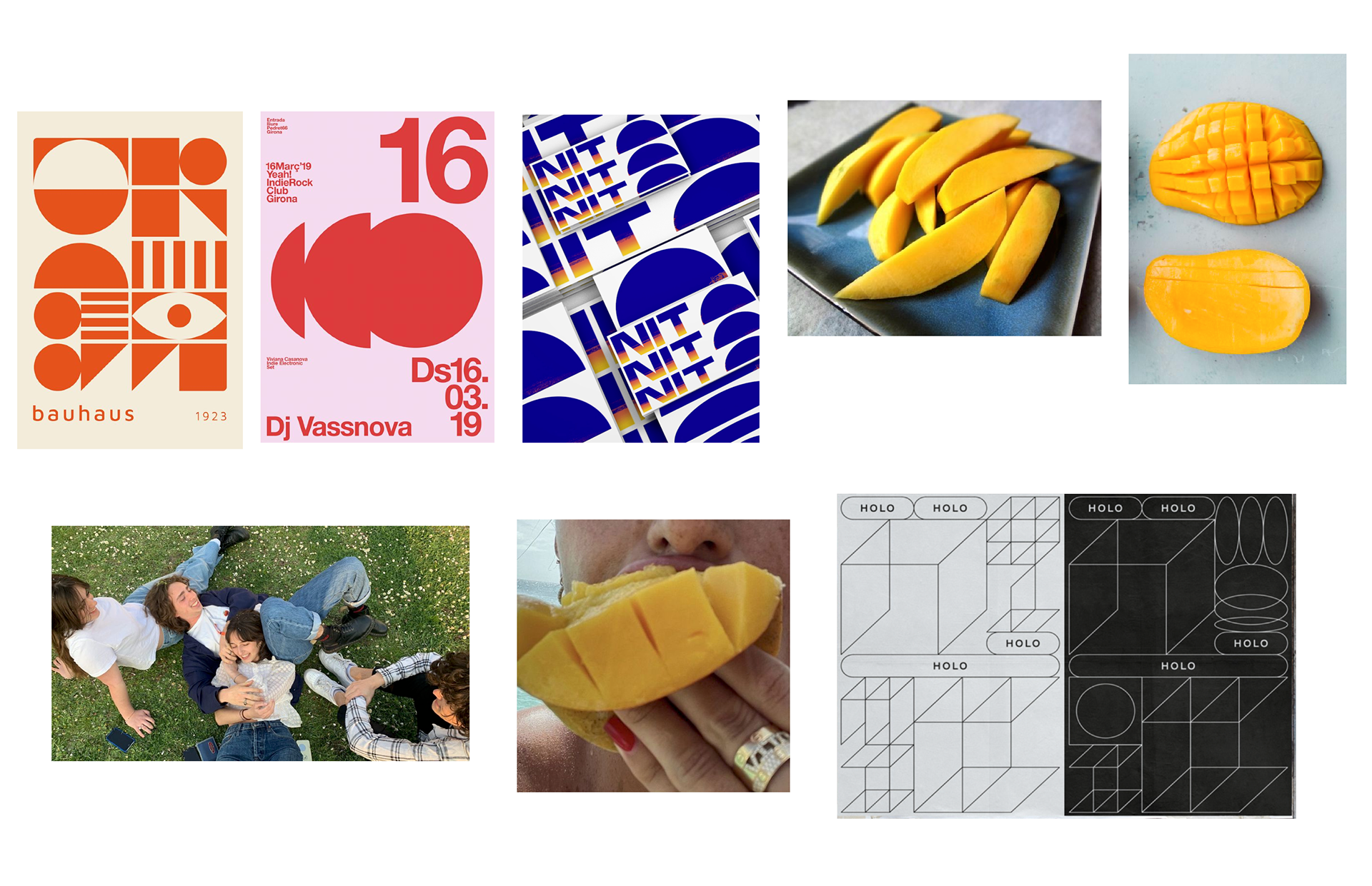
Mood board.
Visual Identity and Design
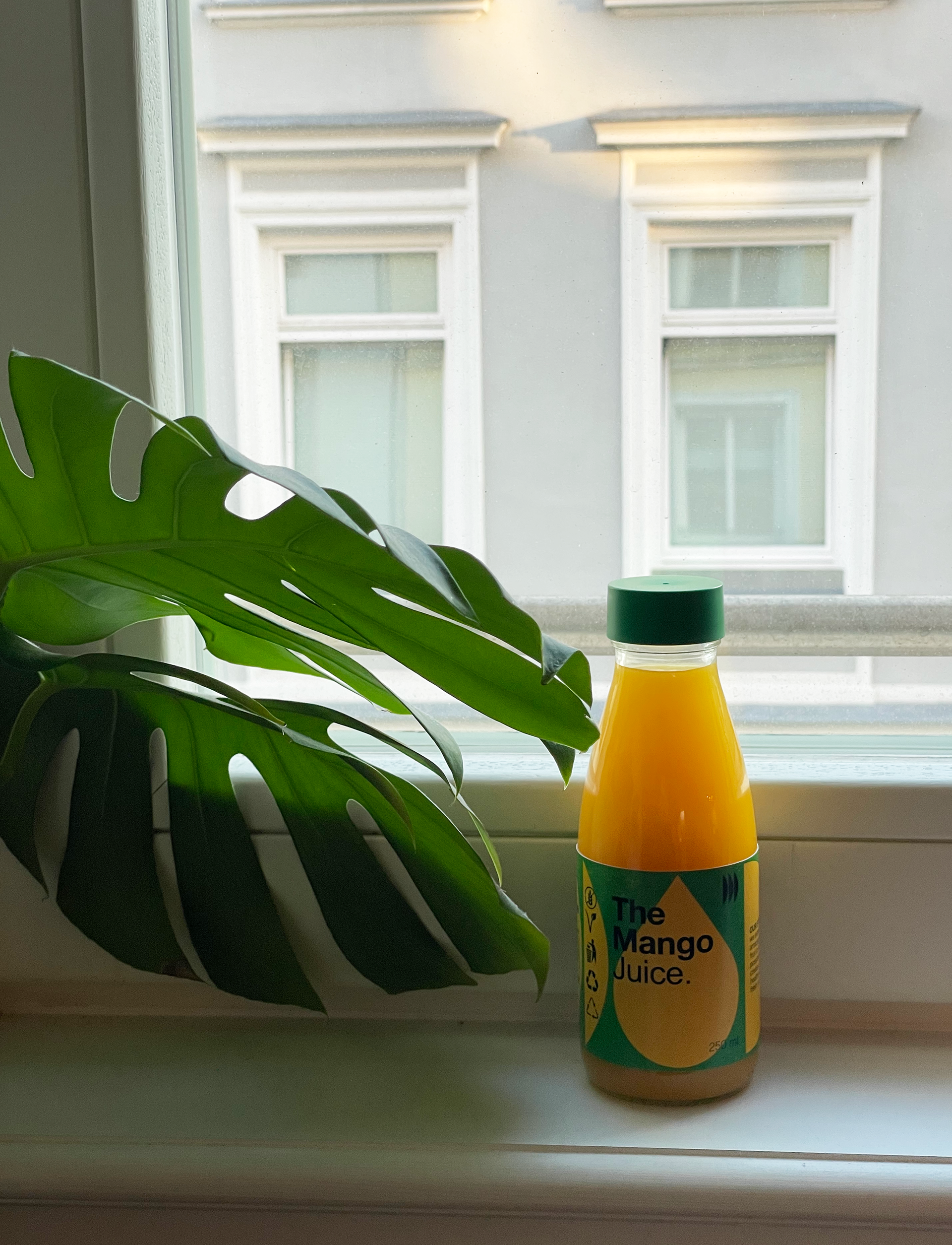
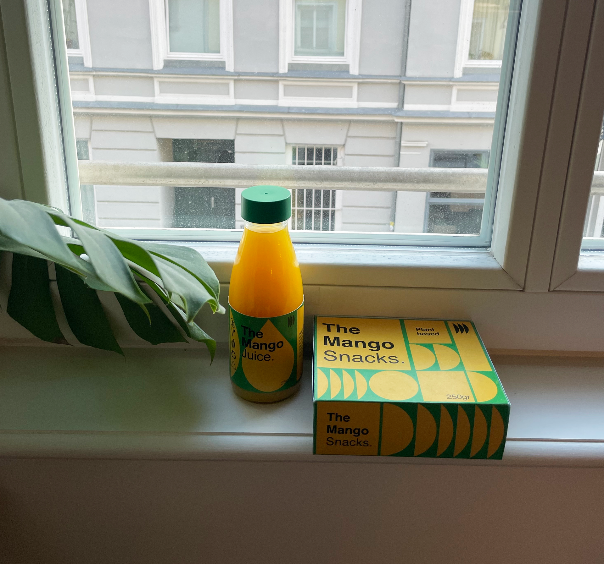
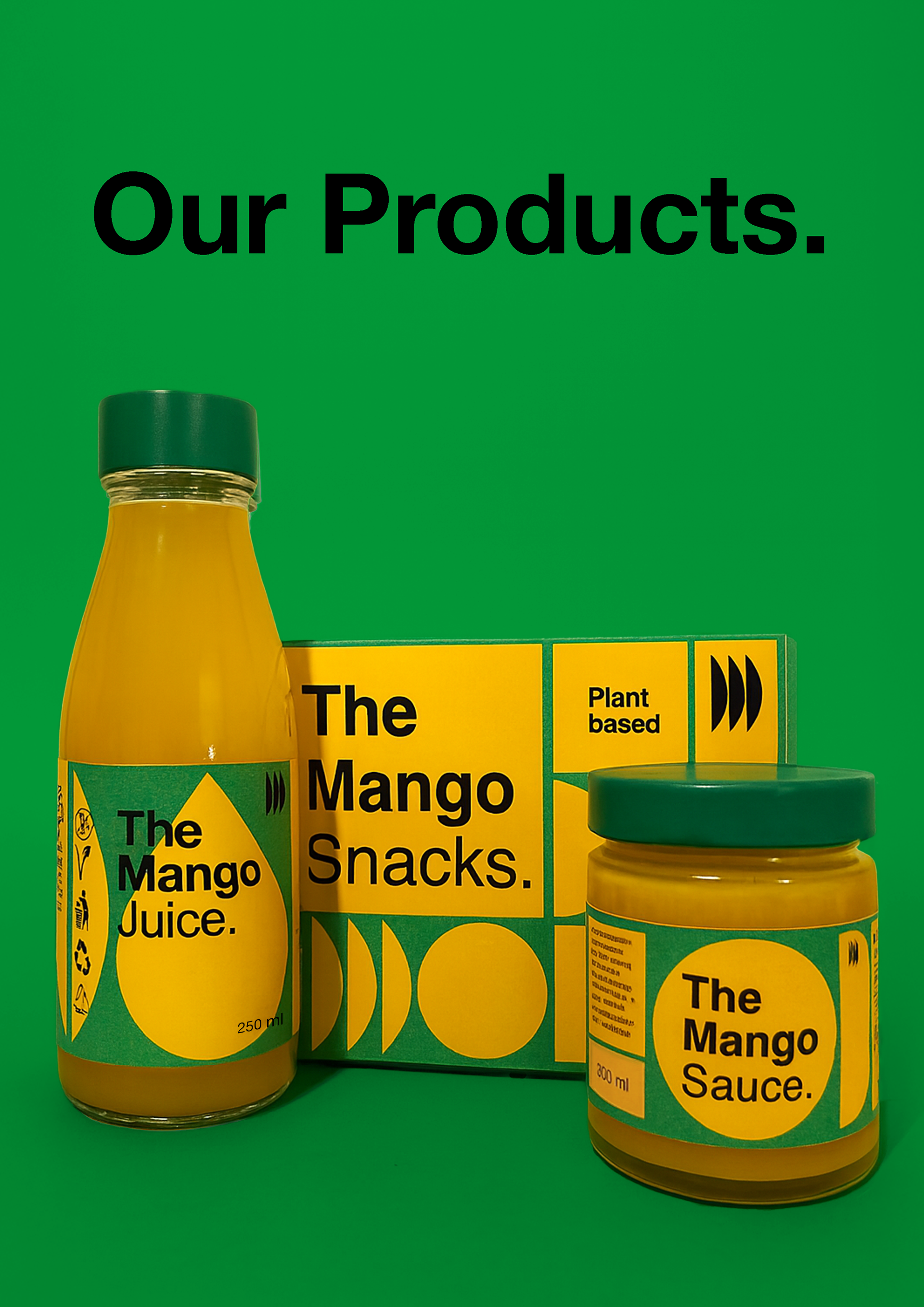
The design was based on Swiss geometric design, using clear structure, grids, and simple shapes. These elements turned the mango’s natural variety into a clean and consistent identity, applied across the different packaging lines.
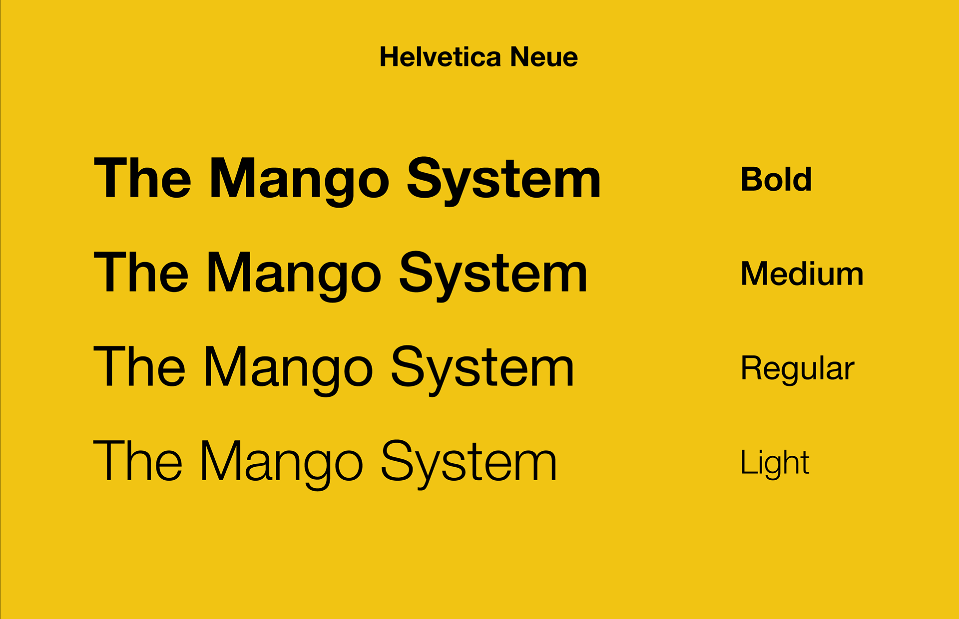
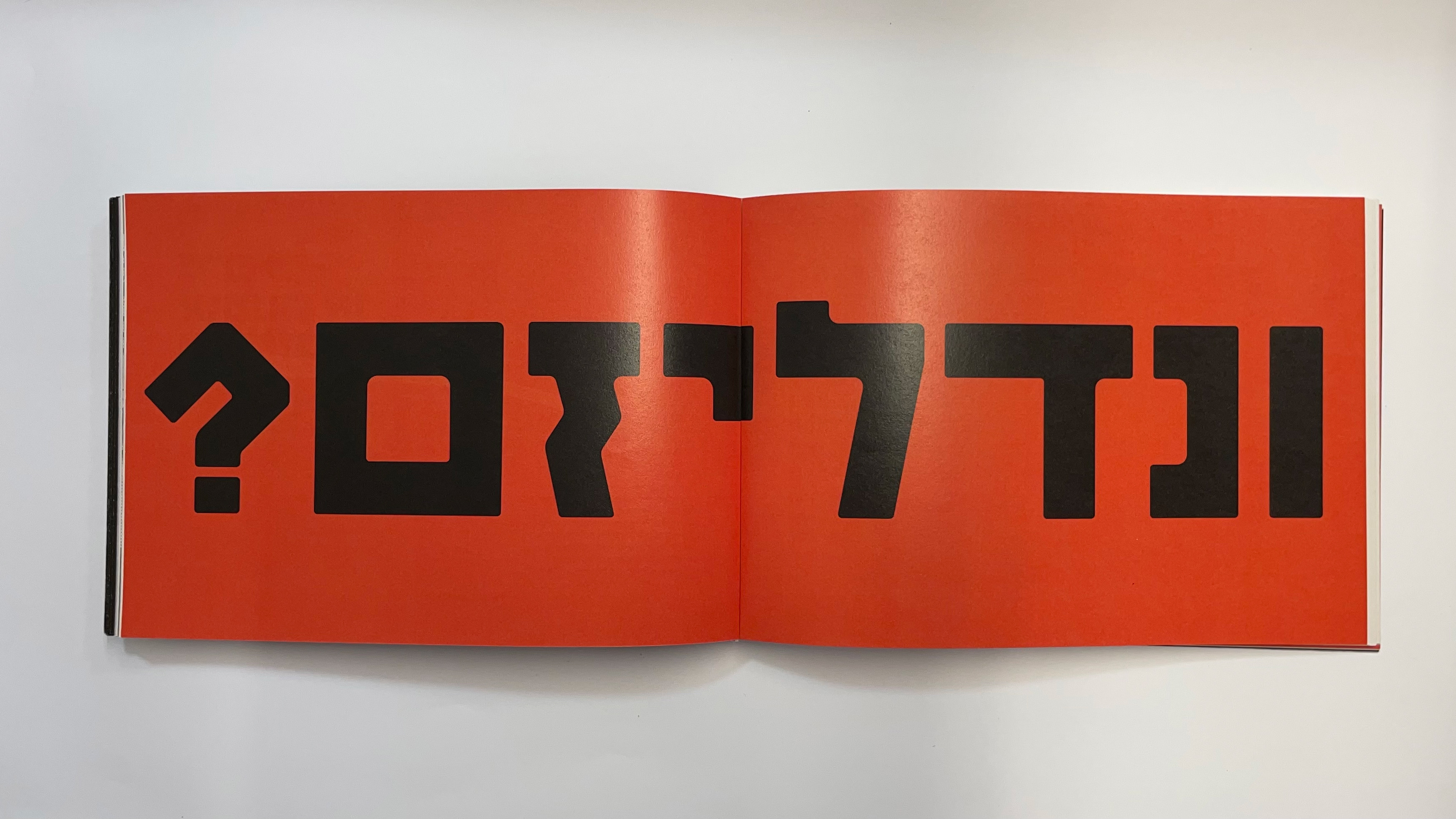
Typography
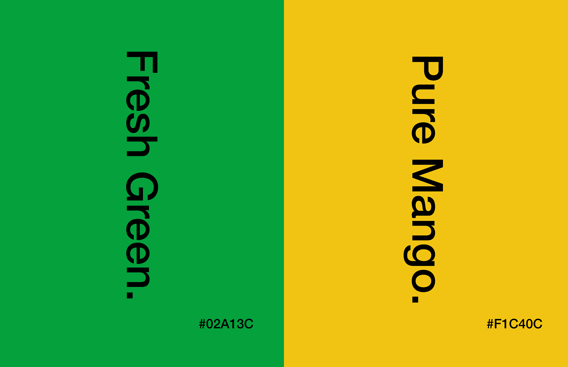
Colors of the Brand
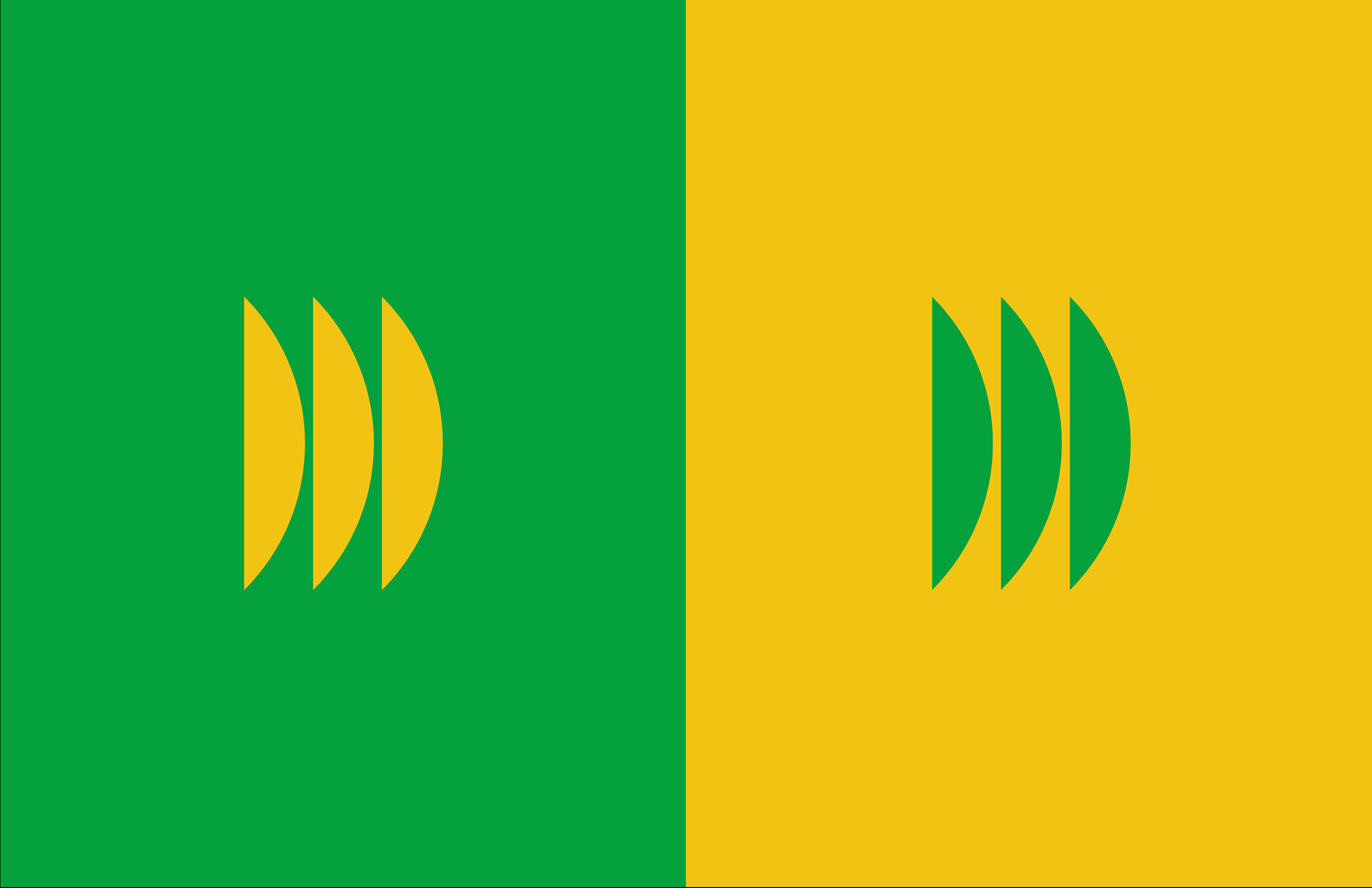
Brand mark